Your cover has about two seconds to do its job.
That is roughly how long a shopper spends scanning a row of thumbnails before deciding what to click. In that window, nobody reads your title carefully, admires your typography, or appreciates the symbolism you worked into the background. They register a genre, a mood, and a rough sense of whether this book is for them, and then they either click or they keep scrolling.
This is why book cover design mistakes are so expensive. A cover does not fail loudly. It fails quietly, in the form of impressions that never turn into clicks, ad spend that produces nothing, and a book that seems invisible despite being right there in the search results.
Below are the twelve mistakes we see most often, how to spot each one on your own cover, and what to do about it. If you are wondering whether your cover is the problem, the diagnostic section below will tell you in about ten minutes.
First, How to Know If Your Book Cover Is Bad
Authors are the worst judges of their own covers, for an obvious reason. You have seen it hundreds of times, you know what every element means, and you probably had emotional input into it. None of that is available to a stranger scrolling past.
Three checks cut through this:
- The thumbnail test. Shrink your cover to about 150 pixels wide, the size it appears in Amazon search results. Can you read the title? Can you tell the genre? If either answer is no, nothing else on this page matters until that is fixed.
- The shelf test. Open the Amazon bestseller list for your exact subcategory. Screenshot the top 20 covers, drop yours into the grid, and look at it as a stranger would. Does it belong there? Does it stand out for the right reasons, or does it look like the one thing that wandered in from another shelf?
- The stranger test. Show the cover, with no context, to five people who read your genre and are not your friends. Ask two questions: what kind of book is this, and would you click it? If they guess the genre wrong, the cover is sending the wrong signal.
Mistake 01
The Cover Does Not Signal the Genre
This is the single most costly mistake, and it underlies several of the others. Readers do not browse for “a good book.” They browse for a specific experience, and they identify it visually before they read a word.
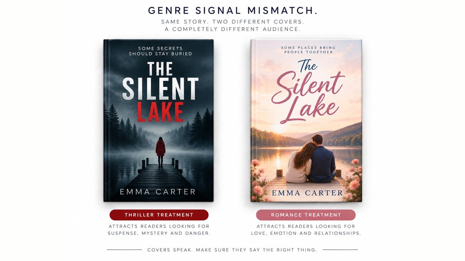
Genre conventions exist because they work. A cozy mystery signals itself with warm colours, illustrated scenes, and playful serif type. A thriller signals with high contrast, sparse composition, and heavy sans serif. A literary novel signals with restraint and unusual typography. When your cover ignores these, readers do not think “how original.” They think “not for me,” and scroll.
The fix: Study twenty covers in your subcategory before any design work begins. Identify the shared conventions. Your cover should sit inside those conventions and then differentiate through execution, not by breaking the rules entirely.
Mistake 02
The Title Is Unreadable at Thumbnail Size
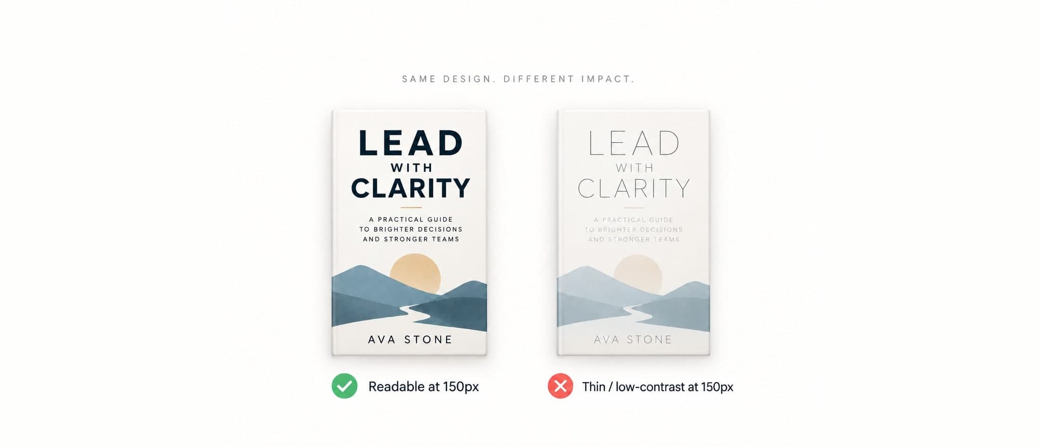
Type that looks elegant at full size frequently disappears at 150 pixels. Thin fonts vanish. Script fonts turn into texture. Low contrast titles blend into the background image. Long titles set small become a grey smudge.
The comparison at the top of this article is the whole problem in one picture: two versions of the same design, identical in composition, and only one of them still says anything at the size a browser actually sees it.
The fix: Design at thumbnail size and scale up, not the other way around. Title first, everything else second. If your title is long, the cover should be built around solving that problem rather than shrinking the text until it fits.
Mistake 03
Too Many Elements Competing for Attention
New authors often want the cover to carry the whole story. A character, a setting, a symbolic object, a texture, a tagline, a series banner, and a quote. At thumbnail size this collapses into visual noise.
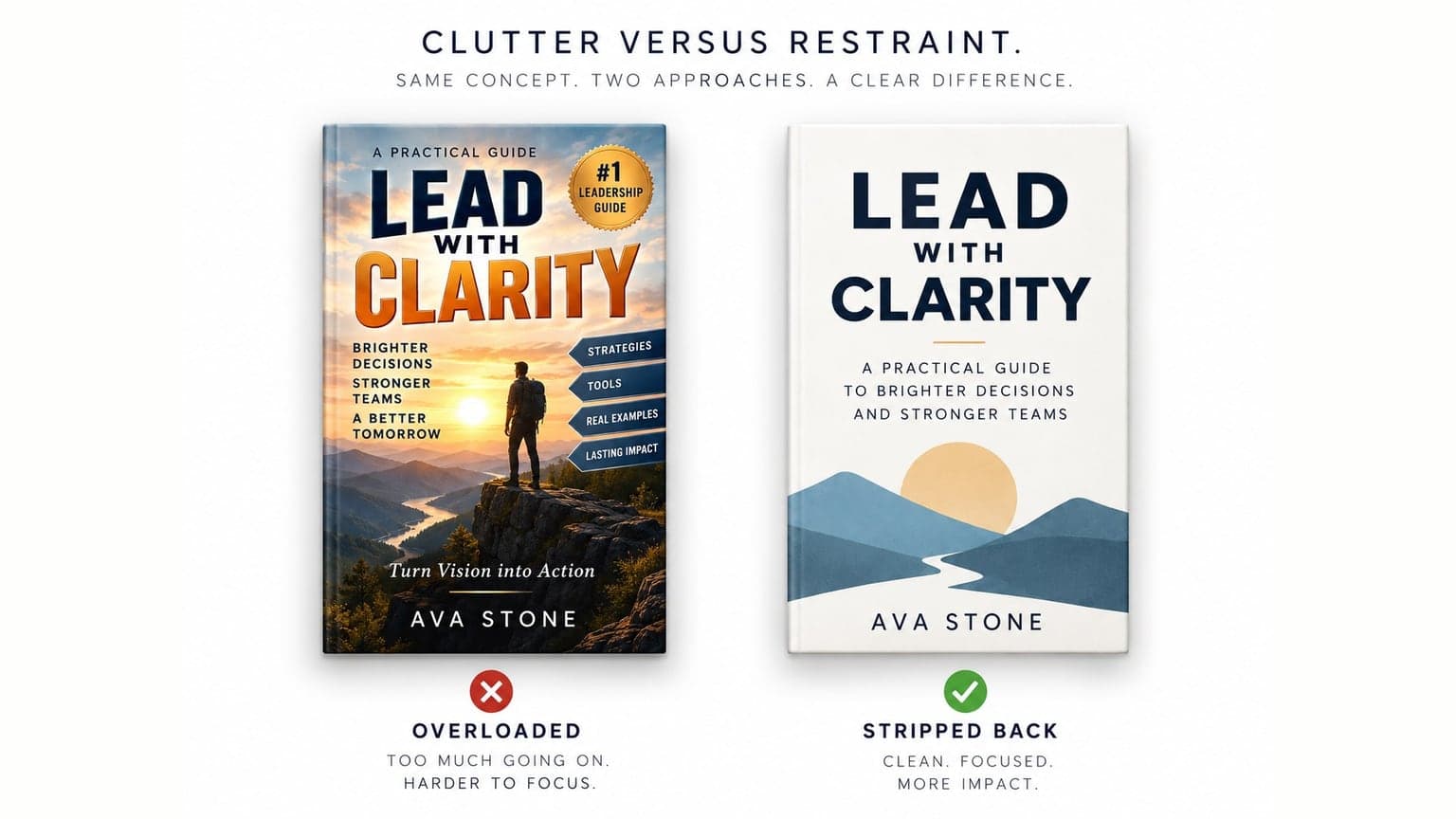
The strongest covers usually have one focal idea and a lot of empty space. Restraint reads as professional. Density reads as amateur.
The fix: Remove elements until removing one more would break the concept. That is usually the right number.
Mistake 04
Fonts That Fight Each Other or Fight the Genre
Typography carries more genre information than most authors realise. Papyrus, Comic Sans, and Curlz have specific associations that no amount of good imagery will overcome. Beyond the obvious offenders, the more common error is using three or four typefaces on one cover, or pairing fonts that belong to different eras and moods.
The fix:Two typefaces is usually the ceiling. One for the title, one for the author name and any subtitle. Choose the title font by looking at what your genre's bestsellers use, since those conventions are readers' expectations, not accidents.
Mistake 05
Stock Photography Used Straight
Stock imagery is not the problem. Unmodified stock imagery is. If a reader has seen the same model, the same forest path, or the same silhouette on three other books, your cover reads as generic even if everything else is done well.
There is also a practical risk: two books in the same genre with the same stock image, which happens more often than you would think.
The fix: Stock should be raw material, not the finished product. Composite, colour grade, crop unusually, or combine sources. If you licence an image, check whether it appears on competing covers first.
Mistake 07
The Ebook and Print Covers Were Not Designed as Different Objects
An ebook cover is a flat image viewed mostly at thumbnail size. A print cover is a physical object with a front, spine, and back, held at arm's length, with a bleed area and a trim tolerance. Designing one and stretching it into the other produces cropped text, a spine with misaligned type, and back cover copy that runs too close to the edge.
The fix: Design the front for thumbnail impact, then build the full wrap separately with correct spine width for your page count and paper, proper bleed, and safe margins. This is also where interior book formatting and cover work need to line up, since page count determines spine width and cannot be finalised until the interior is set.
Mistake 08
The Cover Does Not Match the Book Inside
A cover promises an experience. When the book delivers something different, the result is not just a lost sale but a bad review, which is worse. A dark literary novel with a bright romantic comedy cover will attract exactly the wrong readers, and those readers will say so publicly.
Look again at the two treatments of the same novel further up this page. Neither cover is badly made. Only one of them is honest about the book behind it, and the other one is buying a one-star review at full price.
The fix: Ask whether your cover promises the tone, the heat level, the age range, and the pace that the book actually delivers. Accuracy sells better than aspiration.
Mistake 09
Designing It Yourself to Save Money, Then Spending More on Ads
There is nothing wrong with Canva. There is something wrong with using it to produce a cover that has to compete against covers made by people who design in your genre full time, and then paying for advertising that sends traffic to it.
The arithmetic is worth stating plainly. If your cover converts at half the rate a professional one would, every advertising dollar you spend does half as much work, permanently. The cover cost is one time. The conversion penalty is not.
The fix: If you are advertising at all, the cover is not the place to economise. Professional book cover design is one of the few publishing investments with a clearly traceable return, because you can measure click through rate before and after.
Mistake 10
Ignoring How the Cover Looks in Every Context It Appears
Your cover will appear as a search thumbnail, an ad unit, a social share image, a black and white Kindle display, a printed paperback, and a tiny icon on a reader's device. Colours that pop on your monitor may be muddy in print. A cover that depends on subtle colour difference disappears entirely on an e-ink screen.
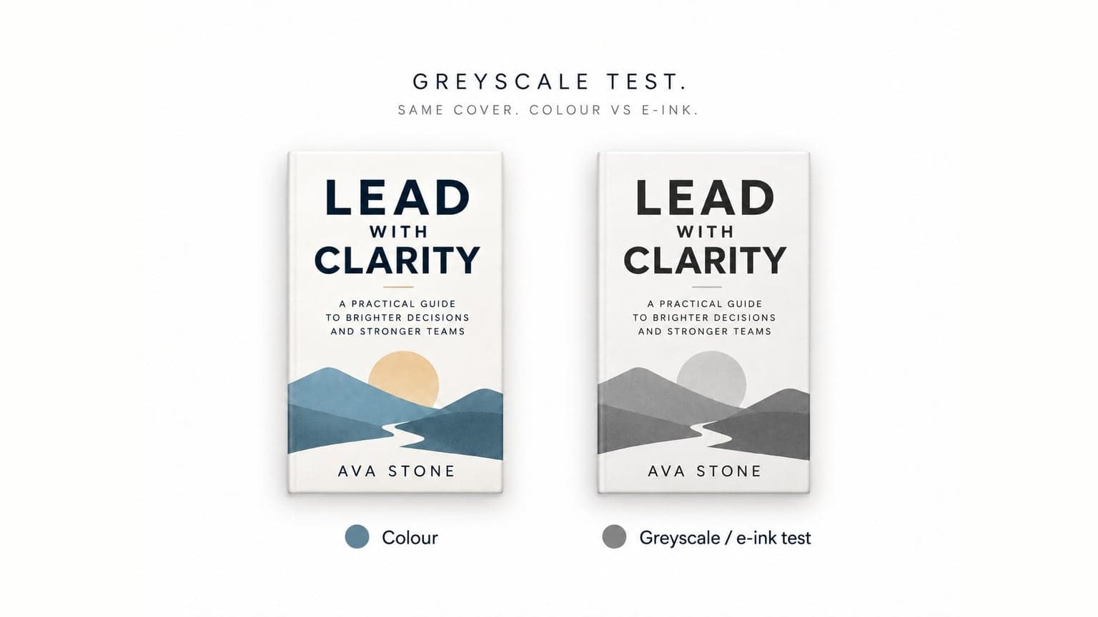
The fix: Check the cover in greyscale, at thumbnail size, on a phone screen, and as a physical proof before finalising. Order the proof. Screens lie about colour.
Mistake 11
Getting Feedback From the Wrong People
Friends and family will tell you the cover is beautiful. They are being kind, and they are also not your market. Feedback from people who do not read your genre actively misleads you, because genre conventions look strange from outside.
The fix: Ask readers of your genre. Reader groups, genre specific forums, and your ARC team are worth more than a hundred supportive comments from people who love you.
Mistake 12
Treating the Cover as Final When It Is Not
Many authors believe changing a cover after publication is impossible or damaging. It is neither. You can upload a new cover file on KDP without republishing, and your reviews, ranking history, and sales record stay with the book.
A cover is a testable variable. If your book gets impressions but few clicks, the cover is the most likely cause and the easiest thing to change.
The fix: If your cover is underperforming, replace it. Then measure click through rate for the following month. This is one of the few marketing decisions where the feedback is fast and unambiguous.
Genre Specific Cover Notes
Genre conventions differ enough that general advice only takes you so far.
Children's Book Cover Design
The illustration is the product. Parents, grandparents, and teachers make the purchase, and they judge quality almost entirely on the art. The cover also needs to communicate the age range immediately, since a board book buyer and a chapter book buyer are shopping for different things.
Consistency matters more here than in any other category. If the cover art and the interior art look like they came from different hands, the buyer notices. This is why children's book illustration is usually commissioned as a single body of work rather than piece by piece.
Memoir Cover Design
Memoir covers tend toward restraint. A single strong image, often personal or symbolic, with clean typography. Overly designed memoir covers read as fiction, which misleads the reader. The subtitle usually does the heavy lifting, since it tells the browser what the story is actually about.
Thriller and Suspense Cover Design
High contrast, limited palette, heavy sans serif type, and a single ominous element. Thriller readers scan quickly and expect visual shorthand. This is a genre where following convention closely is rewarded.
Romance Cover Design
Romance is the most convention driven category, and subgenre matters enormously. Illustrated covers signal contemporary and lightheartedness. Photographic couple covers signal a different heat level and reader expectation. Getting this wrong attracts readers who want something else, which shows up in reviews.
Nonfiction and Business Cover Design
Clarity beats artistry. Large readable title, a subtitle that states the outcome, credibility markers if you have them, and a restrained palette. Nonfiction buyers are scanning for a promise, not an aesthetic.
How Much Should a Book Cover Cost?
There is no single answer, but there is a useful way to think about it.
| Tier | What you get | When it makes sense |
|---|---|---|
| Template based | Marketplace gigs and pre-made templates. Inexpensive, and generally look it. | A book with no advertising budget and modest ambitions. |
| Custom | A cover built from scratch by a designer who works in your genre. | Where most self published authors land, and where the conversion difference becomes visible. |
| Illustrated or composite | Custom illustration, hand lettering, or complex composite work. More skill, more time. | Illustrated books and series where the cover carries the brand. |
The question that actually matters is not what a cover costs but what a weak one costs you. If you plan to spend anything on advertising, the cover determines the efficiency of every dollar after it. If you plan to spend nothing on advertising, the cover is doing all your marketing by itself. Either way it is not the place to cut.
For a full picture of how the cover sits alongside your description, keywords, and reviews, see our guide on why your book isn't selling on Amazon, which covers the other elements a browser judges before buying.
What to Fix First
If you only change one thing, change readability at thumbnail size. It is the cheapest fix and the one that affects every single impression your book receives.
After that, in order:
- Genre signal, since sending the wrong signal wastes every click you get
- Visual clutter, because simplicity almost always improves thumbnail performance
- Typography, particularly font count and pairing
- Stock image differentiation
- The print wrap, if your paperback looks weaker than your ebook
The Short Version
A cover is not artwork. It is a two second argument for why a stranger should stop scrolling.
Most book cover design mistakes come from designing for the author rather than the browser: too much meaning packed in, too little readability, and a genre signal that says something the book does not deliver. Fix readability first, genre signal second, and everything else after.
If your book is already published and underperforming, the cover is testable, replaceable, and the fastest variable to change.
Frequently Asked Questions
How do I know if my book cover is bad?
Run the three checks above: shrink it to thumbnail size and see if the title reads, drop it into a grid of your category's bestsellers and see if it belongs, and show it to five genre readers with no context to see if they identify the genre correctly. If your book gets impressions but very few clicks, that is a strong signal too.
Should I design my own book cover?
You can, and some authors with design backgrounds do it well. The question is whether your cover will compete against professionally designed covers in the same search results. If you plan to advertise, a weak cover reduces the return on every dollar you spend, which usually costs more than the design would have.
Can I use Canva for my book cover?
Canva is a capable tool, and the tool is rarely the limiting factor. The limitation is usually genre knowledge and typographic judgment rather than software. A designer who reads your genre using basic tools will outperform an author with no design background using professional ones.
Can I change my book cover after publishing?
Yes. You can upload a new cover file to your existing KDP listing without republishing the book. Your reviews, ranking history, and sales record all stay with the title.
How much does a book cover cost?
It varies widely depending on whether the work is template based, custom, or fully illustrated. The more useful comparison is against your advertising budget, since the cover determines how efficiently that budget performs.
Does the cover matter for ebooks as much as print?
Arguably more. An ebook cover is seen almost exclusively as a small thumbnail in a crowded grid, which makes readability and genre signal even more critical than they are on a physical shelf.
My cover is beautiful but the book still isn't selling. What now?
Beautiful and effective are different standards. A cover can be well executed and still send the wrong genre signal or fail at thumbnail size. Work through the checks above, and if the cover passes all three, the problem is likely elsewhere in the listing rather than in the design. Start with the rest of your Amazon listing, or talk to the Evercrest team.

